Title here
Summary here

A few buttons and menus are common in most pages in the Visualize tab. This
page documents those items.
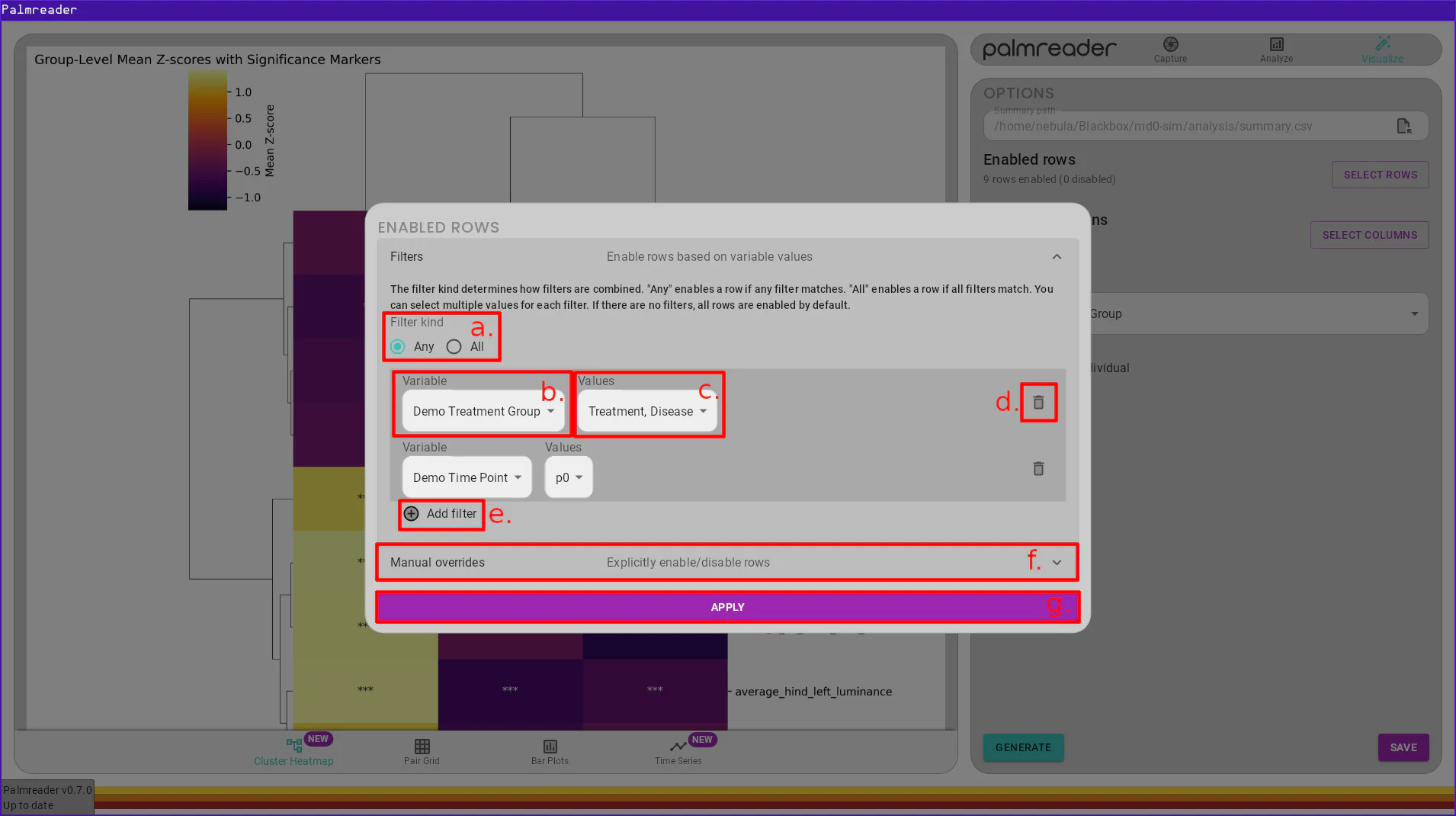
a. – Filter KindThe filter kind option allows you to specify how the filters will be applied. If the kind is “Any”, a row will be included if any of the filters match that row. If the kind is “All”, a row will only be included if all of the filters match that row.
b. – Filter Variable SelectionEach filter has a variable that it will search for an filter upon. This field is where you specify which variable the filter will use.
c. – Filter Value SelectionsEach filter will search for a set of values for its chosen variable. This field
is where you specify which values should match the filter. This field accepts
multiple selections. If an animal belongs to an experiment which does not have
this value, the value N/A will be available in the list and can be chosen to
allow animals without this variable to match the filter.
d. – Remove Filter ButtonThe remove filter button will remove the filter’s row from the list of filters, deleting the filter.
e. – Add Filter ButtonThe add filter button will add an empty row to the list of filters, allowing you to specify a new filter.
f. – Manual Overrides SectionThe manual overrides section allows you to visually disable rows in the summary. Upon opening this section, you will see a table that contains the exact data contained within the summary, with a checkbox to the left of each row. You can manually toggle rows by unchecking their corresponding box. This system works alongside filters. Any checkbox that is gray, regardless if checked or unchecked, represents the enablement of that row after filters are applied. Any blue checkboxes represent the overridden value. The “RESET” button will remove all manual overrides, reverting the table back to using only the specified filters (if any).
g. – Apply Filters Button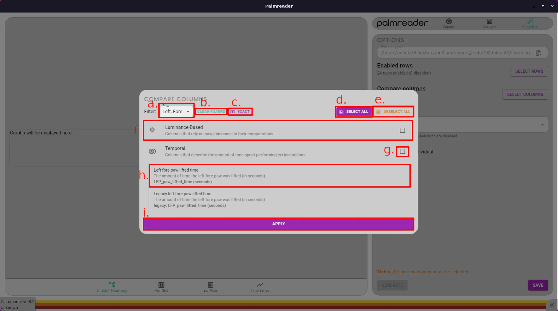
a. – Paw FiltersThis select box allows you to filter which paw(s) to show columns for. You can select any combination of left, right, fore, and hind. See Filter Mode Button for a description of how these filters are applied.
b. – Clear Filters ButtonThis button simply resets any paw filters which may have been selected. When no filters are selected, every available column is displayed.
c. – Filter Mode ButtonThe filter mode button has two modes: Exact (default) and Fuzzy. The button displays the mode that is currently active, and clicking the button will switch between them.
In Exact mode, columns will only be listed if they contain information from the exact combination of paws selected. This means that if the filter is set to Hind and Left, then only columns that solely use the hind left paw will be displayed. Columns that use, for example, both the hind left AND right paw will not be displayed.
In Fuzzy mode, any column which uses information from any of the selected paws will be displayed. This means that if a filter is set to Hind and Left, and column which uses the hind left paw will be displayed, even if it also uses the hind right paw in its calculation.
d. – Select All ButtonThe select all button will select all columns that are currently visible (i.e. columns that match the filter). When no filters are selected, clicking this will select every column. If a filter is enabled, this will only select the columns which match that filter. This allows you to quickly select, for example, all columns which provide readings for the hind left paw, without needing to sift through every column to find those which read out the desired paw.
e. – Deselect All ButtonThis button simply deselects every column; it does not care about filters.
f. – Category HeaderThis header displays information about the category it represents. It is a button that, when clicked, will open the list of all columns in that category. All columns listed beneath it will match the current filter, if any.
g. – Enable All CheckboxThis checkbox will enable all columns currently listed under this category. Similar to the Select All Button, this will only enable columns which match the current filters. If it is partially checked (denoted by a horizontal line through the checkbox), checking it will select the remaining columns in the list. If it is fully checked (denoted by a checkmark), checking it will deselect every column in the list.
h. – Column List ItemEach column has a corresponding list item. It has the human-friendly name and description as the first two lines respectively, then the actual column name in the CSV as the last line. Each item is a button and can be selected by clicking it. Selected columns are tinted blue.
i. – Apply ButtonOnce you’ve made your selection of columns, you must press the “APPLY” button to have your changes take effect. Clicking off of the “COMPARE COLUMNS” dialog will cause your selection to be ignored.
The generate graph button will use the provided settings and begin rendering the requested graph. Rendering time depends on the type of graph. A circular progress element will appear on the left side of the screen while the graph is rendering.
The save button will open a file selection dialog, allowing you to save a PNG version of the graph to the chosen location.
Currently, all saved graphs are .png files and cannot be saved as any other
file type.
The graph frame displays the most recently generated graph. If the graph does not fit in the screen, you’ll be able to scroll down to see the rest of it. Alternately, you can click on the image to open the fullscreen image viewer.
While the image viewer is open, you can use the scroll wheel to zoom in and out. Clicking and dragging the mouse will pan the image around. You can close the image viewer either by pressing ESC or pressing the X icon in the top right corner.
Careful!
The button to close the image viewer is directly beneath the button to close the application. Take care to press the button underneath the window frame, contained within a gray quarter-circle, or just use the ESC key.