Title here
Summary here

This page is located at Visualize > Time Series.
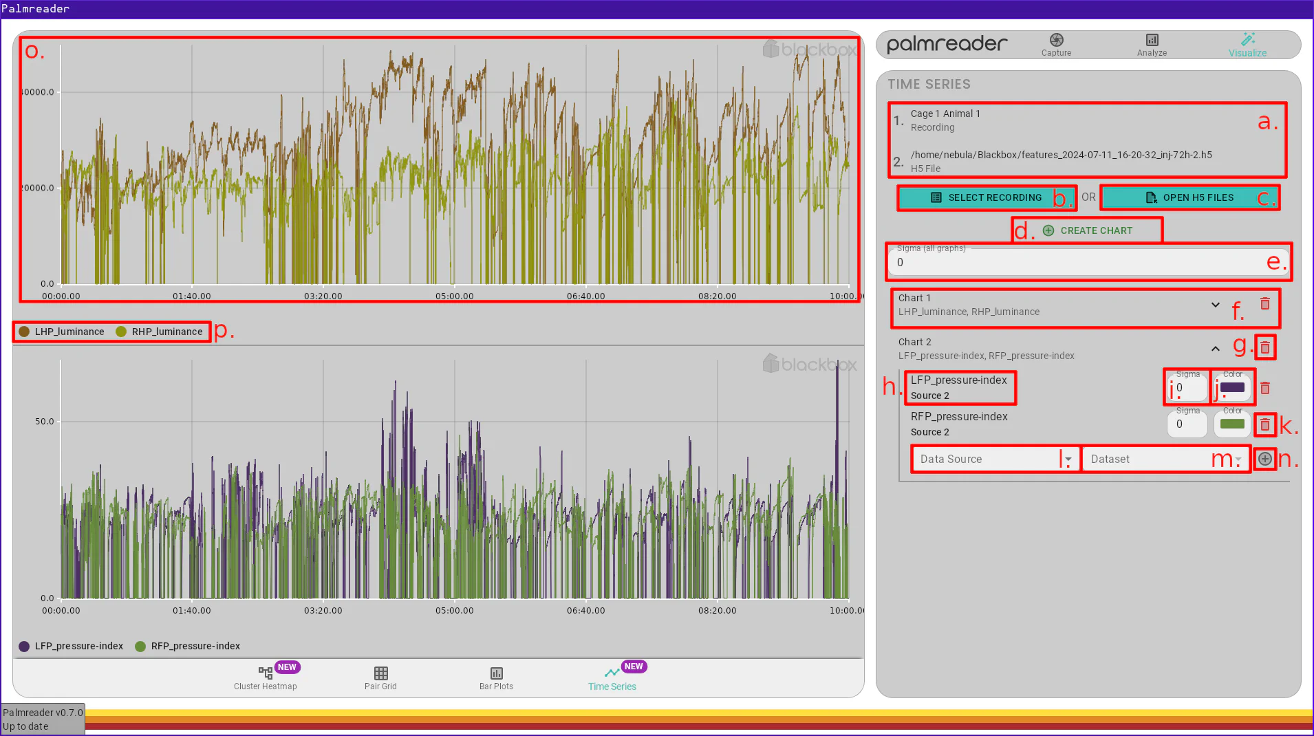
a. – Data Source ListThe Data Source list is where all sources added via the Recording Selection Button and the H5 File Selection Button will appear. A Data Source is what provides the charts with data to graph.
Currently, the only way to remove a data source is to navigate to another page then navigate back to this one. This will reset the state of this page.
b. – Recording Selection ButtonThe recording selection button will open a dialog which displays a UI much like
the Analyze > Analyze page. Only one recording may be selected at a time, but
this button can be used multiple times to add multiple recordings to the
Data Source List. Recordings that have not been
analyzed will cause an error if selected (in the future, they will not be in the
list to begin with).
c. – H5 File Selection ButtonThe H5 file selection button allows you to select one or more .h5 files to
add to the Data Source List. Clicking the button will
open a file selection dialog that allows selecting multiple files. Each selected
file will become a separate Data Source.
d. – Chart Creation ButtonThe Chart creation button will add another Chart to the list of Chart Settings. Currently, this page is limited to 4 charts due to layout constraints (i.e. not enough room on the page). If you have a use case for more than 4 charts, please let us know!
e. – Global Sigma (Smoothing)The global Sigma option applies the provided Sigma to all Graphs on all Charts. This field turns red when the text typed into it is not a valid number. When this happens, it retains the last valid value it had until another valid value is entered. Changing this field will overwrite any values provided to individual graphs.
f. – Chart SettingsThe Chart settings is a collapsible list item that allows you to configure the Graphs contained within the Chart. Only one settings item may be expanded at a time; clicking one will close the others.
g. – Remove Chart ButtonThe remove Chart button will remove the Chart and all of its Graphs.
h. – Graph Dataset & Data SourceThe Graph dataset and data source label displays the Data Source and Dataset for a Graph.
i. – Graph Sigma (Smoothing)The Graph Sigma is the smoothing factor for a single Graph. Changing the Global Sigma will overwrite this value for all Graphs.
j. – Graph ColorThe Graph color option allows you to manually specify the color of the Graph’s time-series in its Chart. A random color will be chosen when the Graph is created, but no guarantees are made about the contrast between randomly generated colors of Graphs within a Chart, so it is sometimes necessary to change this if two randomly generated colors end up being too similar.
k. – Remove Graph ButtonThe remove Graph button will remove the corresponding Graph from its Chart.
l. – New Graph Data Source SelectionThe new graph Data Source selection field allows you to pick a Data Source from the Data Source list. When adding a new Graph to a Chart, this is the first option that must be chosen.
m. – New Graph Dataset SelectionThe new graph Dataset selection allows you to pick the feature you
wish to plot. The list of possible values for this field is determined by the
selected Data Source, so that field
must be entered first. The Dataset names match with the columns in
the summary.csv file generated by the Analyze > Analyze page. A description
of each column in the summary (and thus this list of Datasets) can
be found in the Summary Readouts PDF document which we provide upon request.
n. – Add Graph ButtonThe add Graph button will create a new Graph in the expanded Chart using the chosen Data Source and Dataset. This will add a new list item to this Chart’s Graph list. Each new Graph will have a randomly generated color, and will inherit the value of the Global Sigma. There is currently no limit on the number of Graphs that can be added to a Chart.
o. – Chart FrameThe Chart frame is an interactive plot. It contains a time-series for each of its Graphs. The Chart frame allows for many types of interaction. All frames are synchronized. Each frame evenly splits the available space in the main pane in Palmreader. If there is only one chart, it will take up the entire pane.
p. – Chart LegendThe Chart legend shows a quick reference associating each Graph with its color.
A Data Source is either a recording or H5 file that provides the time series
data. The H5 files are those exported via the Export > Data checkbox in the
Analyze > Analyze page. Recordings must be analyzed to be selected. This concept enables
a Chart to show Graphs from multiple recordings within a
single graphic. Data Sources are referred to by their index, which depends on
the order in which they were added.
A Dataset is a frame-by-frame series of data provided by a Data Source. A Dataset represents a feature that Palmreader has extracted from the corresponding recording, with a single point for every frame in the recording. These points are what is being displayed in a Chart; each Graph displays a Dataset.
A Chart is a graphic that can contain multiple Graphs. All interaction happens on a Chart, and all Charts are synchronized.
A Graph is a single time series contained within a Data Source, displayed on a Chart. A Graph can have a smoothing factor (Sigma) applied to it, as well as a user-defined color.
The Sigma of a Graph is the factor by which a
Gaussian filter
convolution is applied to the data. The Sigma fields are all multiplied by the
framerate of the video. This means a value of 1.0 will result in a value of
45.0 for standard devices, and 90.0 for high-speed devices. Values between
0.0 and 1.0 are allowed, as well as any decimal value.
Our custom implementation of the Gaussian filter is not unlike the
scipy.ndimage.gaussian_filter1d function
,
though varies in the window size. The scipy function computes the window size
as:
radius = round(4 * sigma)
size = 2 * radius + 1
Our implementation computes the window size as (subject to change):
let radius = (3.0 * sigma).ceil() as usize;
let size = 2 * radius + 1;
The aforementioned scaling by the framerate occurs before this calculation.
The Mesh is the area of the Chart frame which has actual coordinates in the data-space. This excludes the margins, axis ticks, etc. This can be visually understood as the area which has a gray grid (mesh) behind it.
When the cursor is moved over the Mesh, a crosshair will appear which allows you to approximate the value at a given position. A small dot which is color similarly to each Graph will appear upon each time series at the Y-coordinate intersecting the X-coordinate of the cursor.
While hovering over the Chart frame (excluding the Legend), using the scroll wheel will zoom either in or out if the wheel is scrolled up or down respectively.
Caveat
Zooming out is constrained by the longest Graph in the Chart frame the cursor is over when zooming. This means if one Chart has a Graph that is 10 minutes, but the longest Graph in the current Chart frame is only 5 minutes, you will be restricted to zooming out until 5 minutes are visible.
This can be worked around by zooming out while the cursor is in the Chart frame that holds the longest Graph.
With the cursor in a Chart frame, you can zoom into a region of the Graphs by holding the Shift key, pressing (and holding) the left mouse button, and dragging the cursor to another position in the graph, then releasing the left mouse button. While dragging, you will see a gray bar overlayed onto the region that will be zoomed into.
While zoomed in, holding the left mouse button and dragging the mouse will drag
the graph, with the cursors actual position in the Mesh fixed. For
example, if the cursor’s actual X-coordinate is 100, the instant the drag is
finished and the left mouse button is released, the cursor’s actual X-coordinate
will be still be 100.